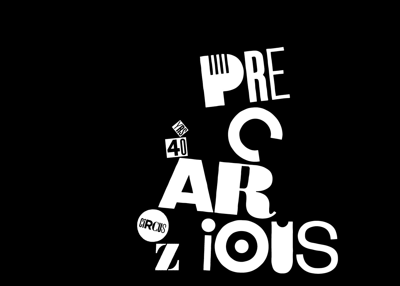
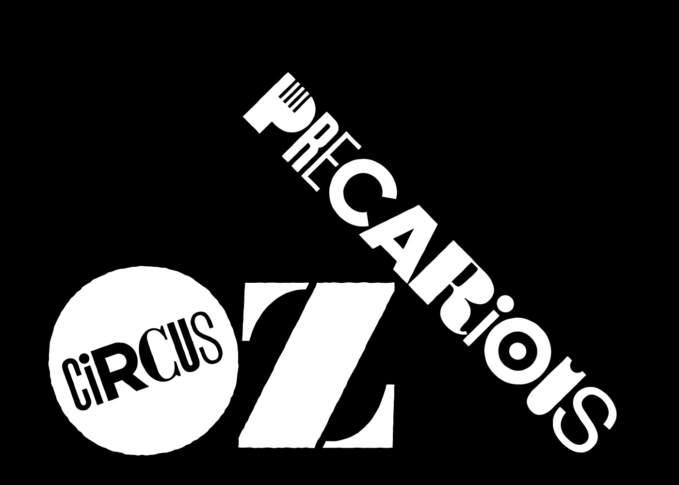
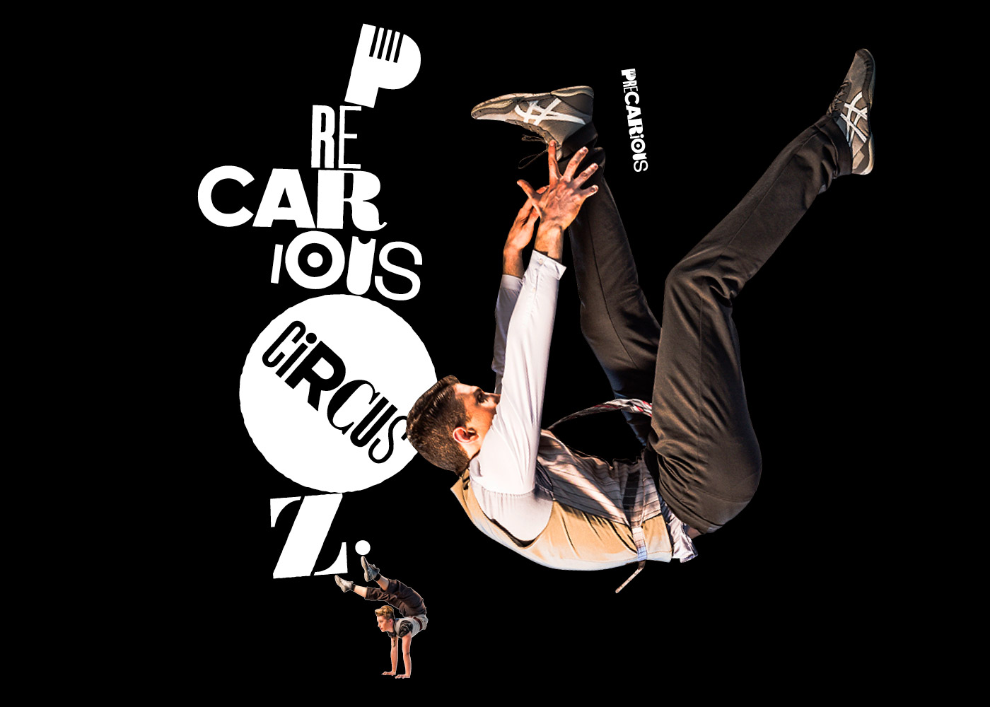
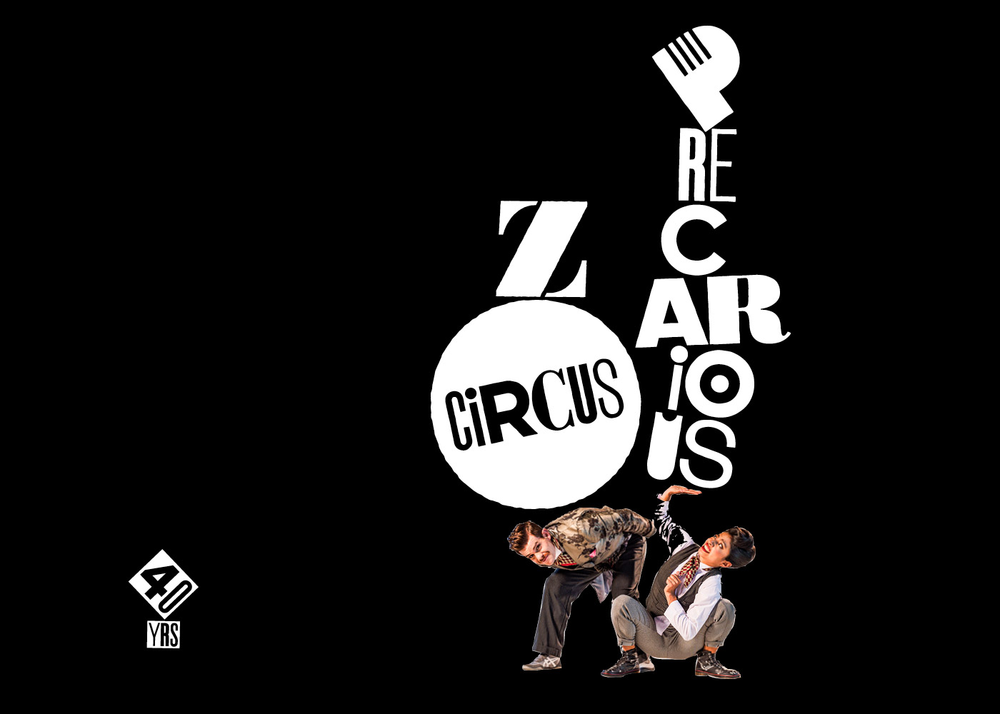

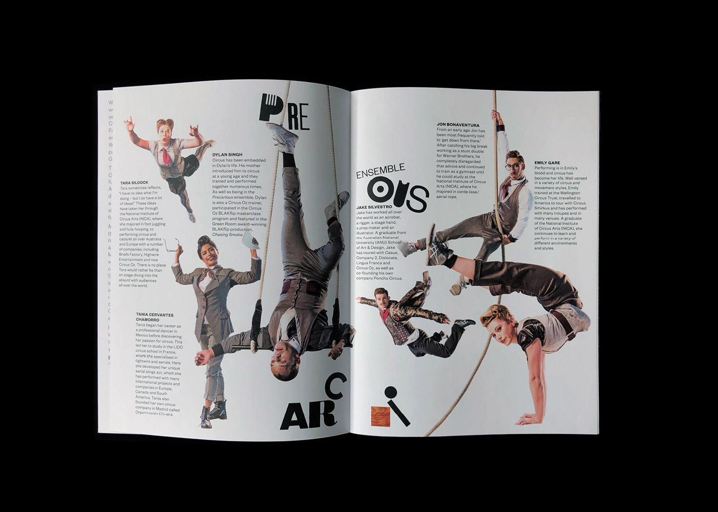


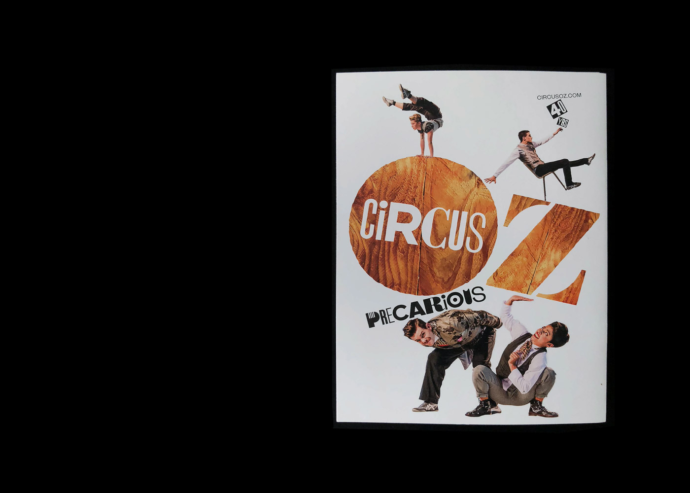


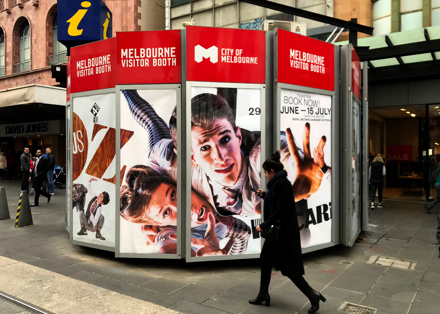
Precarious by Circus Oz
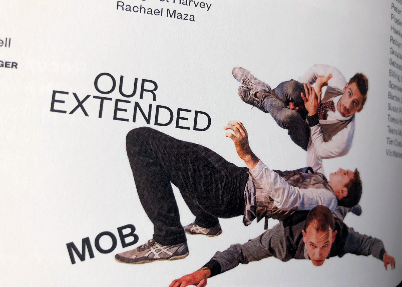
An identity for a Circus Oz production explores the precarious nature of contemporary life. A pared-back visual about a work that is on the edge. Our collective idea of precarious comes from the edge we often encounter in life, between rising and falling, breathtaking risk and the shock of failure.
Balance, tension, gravity are the visual tools at play. Space, scale and visual suggestion helped us tell the story of the impossible tension of elements fighting gravity. The mixed type is a modern response to the mixed type look achieved wood type printing and the Fluxus art movement, in our iteration, we mixed brand type, graphic symbolism and butchered designer type.
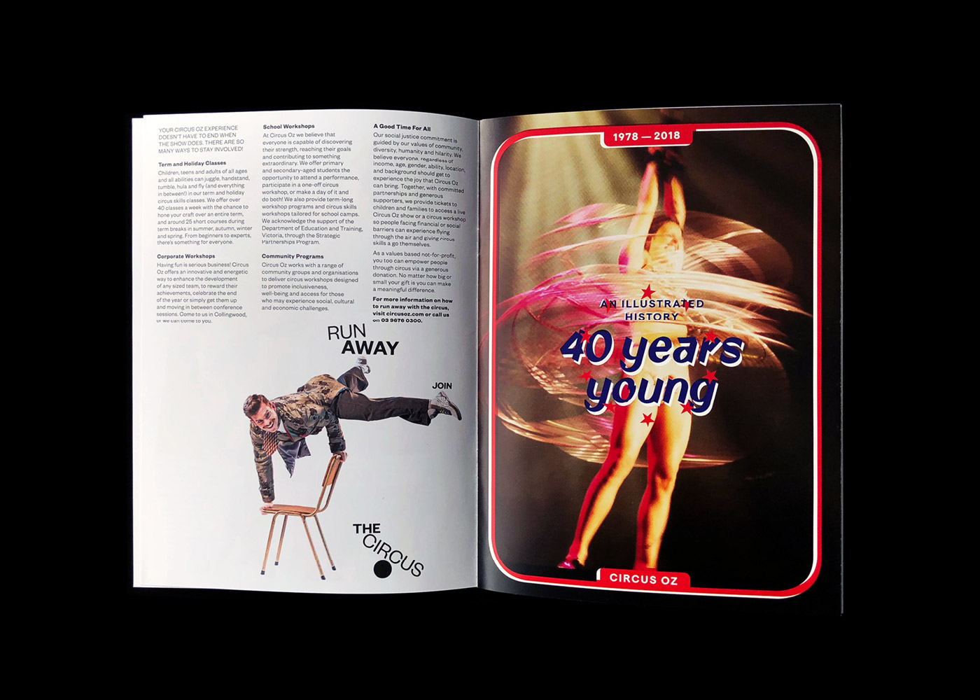
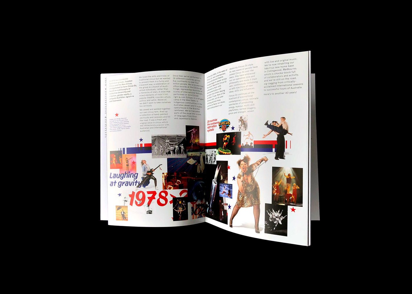
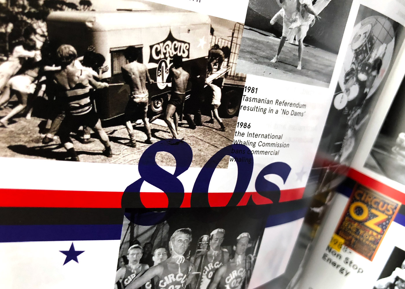
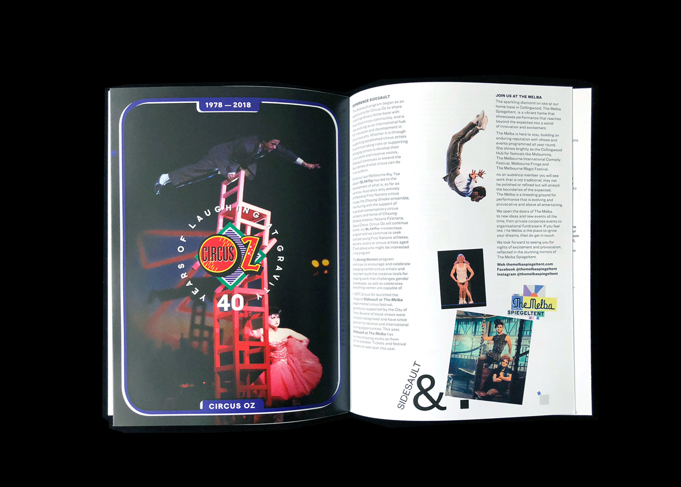
We initiated and devised a 40 year anniversary pull out publication with past creative director Mike Finch, a shorter overview presented cultural, circus and artist milestones.
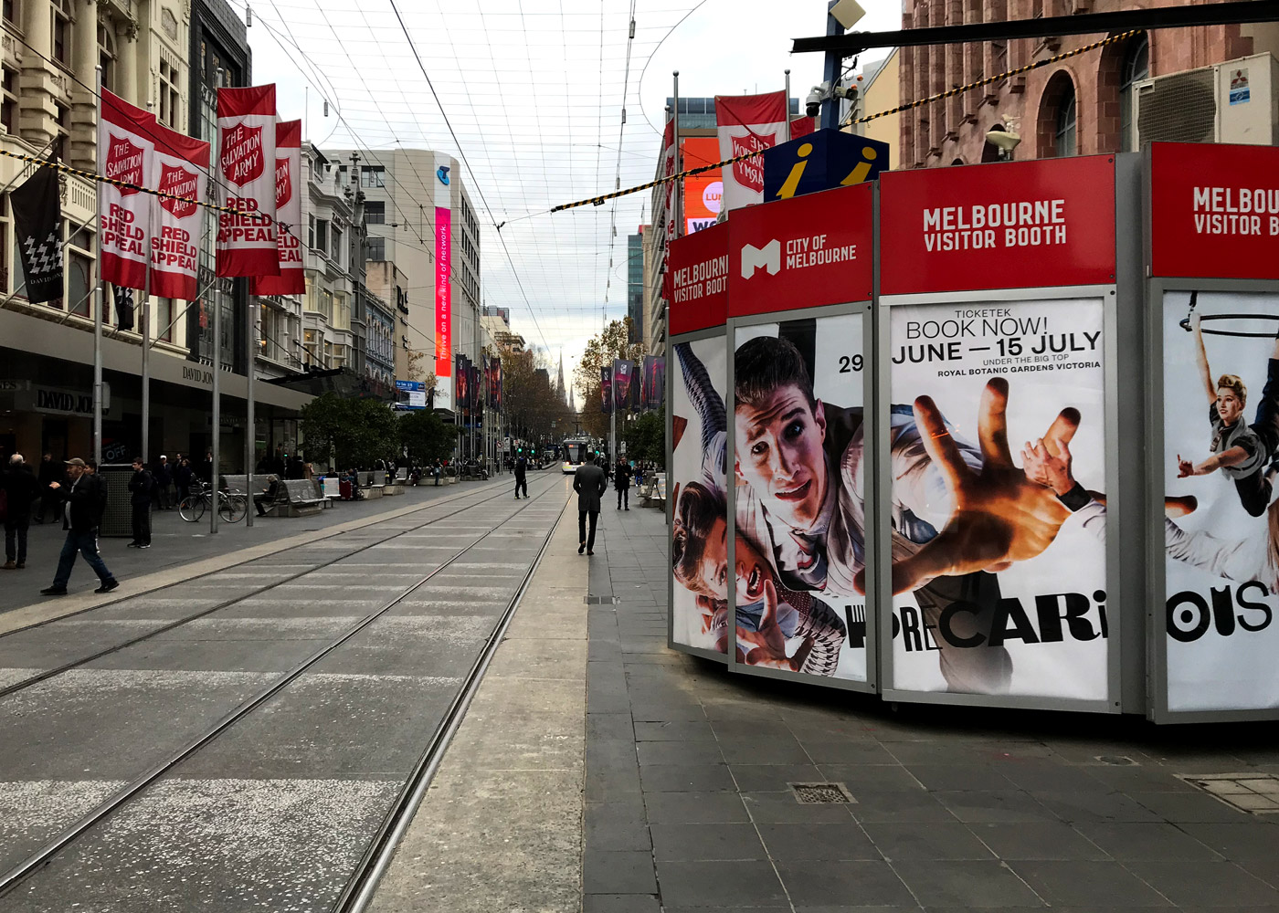
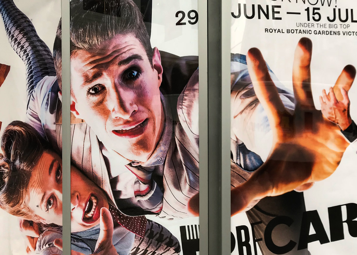
Tickets went sale from 8 May.
Scope of work covered: event identity, concept, art direction, image-making street and digital advertising, and print design, venue signing